


In this guest post, digital artist Nicholas Rougeux describes how he creates the artistic visualizations of sheet music which form the cover image of each OpenScore edition.
Growing up in the suburbs of Cleveland and Chicago, I was never far from a computer from as early as I can remember. I was always been drawn more to the creative tools and puzzle games than violent games, which is probably why I still have the original Mario Paint for the SNES I was given in the 90s. I gave myself many stiff necks by spending hours staring up at the television, creating Nintendo-themed pixelated images and moving icons of Game Boys, airplanes, and cats around to compose music. I spent my childhood playing games like Myst and using tools like Microsoft Paint, Bryce 3D, and Ultra Fractal to create digital art so a natural progression was to find a way of putting those creations online by building websites.
These days, I’m a web designer by day and like to call myself a data artist any other time I get the chance. Data-based art piqued my interested in the early 2010s while working on several data visualization projects, which lead to creating projects about roads, transit, national parks, literature, and more. I enjoy the restrictions a dataset provides because I enjoy thinking of ways to represent its entirety in a pleasing way without letting outliers skew the results.
Like most of my project, visualizing music happened accidentally when I was looking for ideas for new projects. I often browse Pinterest and enjoyed seeing experimental music notation and collected a few pins in a music board. While doing this, I realized that sheet music was just another way of visualizing data and set out to extract the data.
An important side note: Ironically, despite an upbringing in a musical family with parents who were both in the theater during their younger years and watching them play show tunes on our piano throughout my childhood, I could not—and still can’t—read sheet music.
After giving myself a crash course in music notation and making countless mistakes by manually cataloguing each note in simple scores like Moonlight Sonata in a spreadsheet, I sought a saner solution, which lead me to MuseScore. It may sound corny, but finding MuseScore felt like a gift from above that hit all the right notes in my book: free, flexible data conversion, huge online community of examples, and easy enough for a beginner like me to figure out.
Using a combination of MuseScore and a few other tools, I was able to convert sheet into CSV files, which I could with NodeBox to visually explore the data and eventually create Off the Staff—a project that visualizes the pitch, duration, and instruments, for every note from a score. Every image generated is for sale a a poster in a variety of sizes and types of paper.
For example, the image below shows Vivaldi’s Four Seasons: Spring, Summer, Fall, Winter from (left to right, top to bottom). The sheet music is available on MuseScore and posters are available for each as a set or individually.

Visualization of Vivaldi's Four Seasons. Spring (TL), Summer (TR), Autumn (BL) and Winter (BR).
Each dot represents a note in the score. Pitch is indicated by the distance from the center of the image, while the time at which the note occurs is given by the angle from the 12 o'clock position. The size of the dot indicates the duration of the note, and the color of the dot is different for each instrument. The colors of the dots are different for each instrument, and are selected from a complementary palette designed to reflect the theme of the piece.
Creating these images is only possible because the sheet music is stored as structured data or “source code” instead of static images like PDFs. This allows them to be parsed to extract the musical data. MuseScore’s Commons Attribution licence is important to me as an artist because it allows me to sell posters of the images and give credit to the original composers.
Many early examples can be seen in my original blog post and a couple are included below showing how how notes from Moonlight Sonata could be visualized by grouping by their measure.

The opening measures of Beethoven's Moonlight Sonata
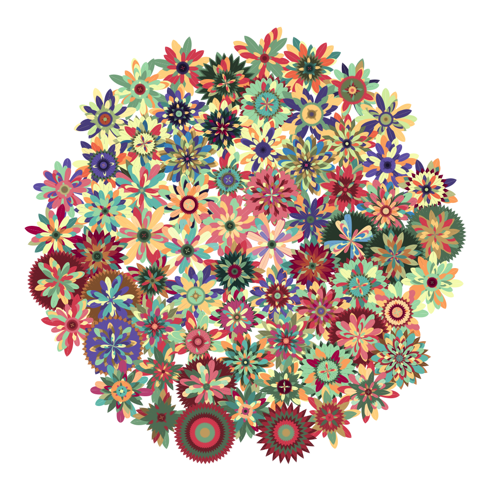
Flower visualization of Beethoven's Moonlight Sonata
The process for creating these images was somewhat convoluted by using several tools to convert and manipulate the data many times. Since the initial concept, I’ve found more efficient methods of manipulating the data to create the images.
When the good people at MuseScore were starting to work on OpenScore to make more sheet music available in their flexible digital format, they asked if I would be interested in creating an image for the cover of each score. I was very excited and was happy to participate. I was also pleased to help create the logo as part of their branding.

Covers of two OpenScore Editions: Fauré's Piano Quintet No. 2 (Op. 115) and Schubert's Allegretto in C Minor (D.915)
Since I first created the images, I and others have wanted to see them in motion while hearing the music. Moving forward, I plan to create an animated video of each score and below is the first result—Pachelbel’s Canon in D.
I’ve found a lot of joy creating these images and seeing the visuals driven by musical data. I’m excited to see what types of visuals can be created from more scores.
Nicholas Rougeux is a Chicago-based digital artist and web developer. From a young age, his fascination with the digital world led to a healthy obsession with data visualization and fractal artwork, which has been published in publications and exhibitions around the world.